Introduction to Graphing Rational Functions
Purplemath
What is a rational function?
A rational function is an equation of the form y = (a rational expression). A rational expression is a polynomial fraction.
Because a rational expression contains a polynomial in its denominator, you have to be careful not to divide by zero. As a result, there will almost always be restrictions on the domain of a rational function, and thus gaps in the graph.
Content Continues Below
How do you graph a rational function?
To graph a rational function:
- Factor the numerator and denominator, if possible; check if anything can be cancelled out.
- Solve the numerator's factors for their zeroes; these will be the x-intercepts of the graph.
- Solve the denominator's factors for their zeroes, keeping in mind that the zeroes of the denominator create vertical asymptotes; these zeroes will be where the graph will have gaps.
- Find the y-intercept, if it exists.
- Look at the degrees of the polynomials in the numerator and denominator; use these degrees to find any horizontal or slant (that is, oblique) asymptotes.
- Plot enough additional points to be able to see what the graph is doing.
- Sketch your graph.
The order of Step 1 through Step 5 is not fixed. As long as you do each of these steps, you'll be in good shape to do the plotting (Step 6) and the graphing (Step 7). Once you get the swing of things, rational functions are actually fairly simple to graph. Let's work through a few examples.
- Graph the following:
Affiliate
Step 1: The polynomials in each of the numerator and denominator are linear (that is, of degree 1), so there is no factoring that needs to be done; nothing cancels.
Step 2: The rational expression (that is, the polynomial fraction) will be zero when the fraction's top is zero, so I'll set the numerator equal to zero, and solve for the x-intercept:
2x + 5 = 0
2x = −5
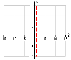
Step 3: Next, I'll find the vertical asymptotes, if any, for this rational function. Since I can't graph where the function doesn't exist, and since the function won't exist where there would otherwise be a zero in the denominator, I'll set the denominator equal to zero to find any forbidden points:
x − 1 = 0
x = 1
So I can't have x = 1, and therefore I have a vertical asymptote there. I'll dash in this asymptote on my graph:
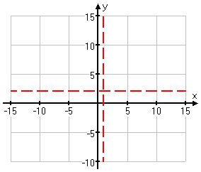
Step 5: Next I'll find the horizontal or slant asymptote. Since the numerator and denominator have the same degree (in this case, they're both linear, having a degree of 1), the asymptote will be horizontal, not slant, and the horizontal asymptote will be the result of dividing the leading coefficients:
I'll dash in the line for this asymptote:
(If you're not sure of how I found these asymptotes, then review the lesson on asymptotes. You will need to be comfortable with this topic before you proceed further with graphing rationals.)
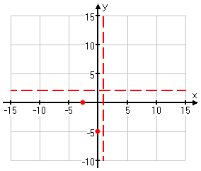
Step 4: Next, I'll find the y-intercept, if it exists.
y-intercept (so x = 0):
Then the intercepts are at (0, −5)and (−2.5, 0). I'll add these points to my graph:
Content Continues Below
Step 6: Now I'll pick a few more x-values, compute the corresponding y-values, and plot a few more points.
| x | |
|---|---|
| −6 | |
| −1 | |
| 2 | |
| 3 | |
| 6 | |
| 8 | |
| 15 |
Affiliate
Advertisement
I mostly picked x-values near the middle of the graph. Because of the horizontal asymptote, I already have a good idea of what the graph does off to the sides.
(It can be a good idea to do a point or two near the ends anyway, as a check on your work.)
Also, since I had no intercepts on the right-hand side of the vertical asymptote to give me hints as to what was happening with the graph, I needed more points there to show me what was going on.
Now I'll plot these points:
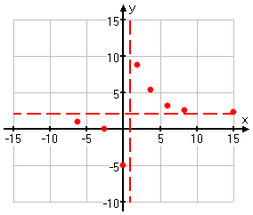
And now I can connect the dots:
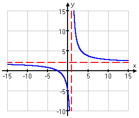
(Yes, I did Steps 4 and 5 out of order, but that's okay. I still ended up with what I needed for graphing this function.)
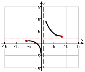
When you draw your graph, make sure you show the graph continuing off to the sides. Don't just stop at a point you've drawn, because this will make it look as though the graph actually stops at that point.
DON'T DO THIS!
Can I just copy my calculator's graph?
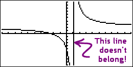
Warning: Your calculator may display a misleading graph for a given rational function. When you graph, you plot some points and then you connect them; your calculator does the same thing. But you're smart enough to know not to cross a vertical asymptote; your calculator isn't that intelligent.
If your calculator shades a pixel down at the bottom of the screen, and then the next computed pixel to be shaded is at the top of the screen, then the calculator is likely to merrily draw a nice vertical line connecting the two dots, like this:
For this reason, you may wish to switch your graphing mode from "line" to "dot" (or the equivalent setting for your calculator model; check your owner's manual). In dot mode, you'll get a graph that looks like this:
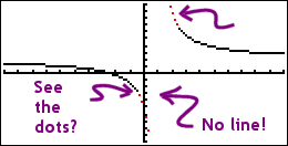
I've highlighted the disconnected dots in red. The whole graph is dots, but most of the dots are right next to each other, so they look like a line. If you keep the graphing mode as "line", you will need to remember that what the screen displays may be somewhat incorrect when graphing rationals.
URL: https://www.purplemath.com/modules/grphrtnl.htm
Select a Course Below
Standardized Test Prep
Homeschool Math
© 2024 Purplemath, Inc. All right reserved. Web Design by ![]()


