An Example of Graphing a Rational Function
Purplemath
When you're graphing rational functions, take the time to label your asymptotes and intercepts.
Plot enough points for you to feel confident in how the graphed line goes; plot more where you're unsure, less where you're fine.
Content Continues Below
- Graph the following:
First, I note that the denominator doesn't factor, so nothing is going to cancel out.
Next, I'll find any vertical asymptotes, by setting the denominator equal to zero and solving:
Advertisement
x2 + 1 = 0
x2 = −1
Affiliate
Since this equation has no (real-number) solutions, then the denominator is never zero, and there are no vertical asymptotes.
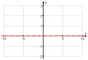
To find the horizontal or slant asymptote, I look at the degrees of the numerator and denominator. The numerator is linear (that is, it is of degree one) while the denimonator is quadratic (that is, it is of degree two). Since the degree is greater in the denominator, the asymptote will be a horizontal at y = 0; that is, the horizontal asymptote will be the x-axis.
I'll sketch this in:

Next I'll find any intercepts, by plugging zero in for each variable, in turn:
y-intercept (so x = 0):
x-intercept (so y = 0)
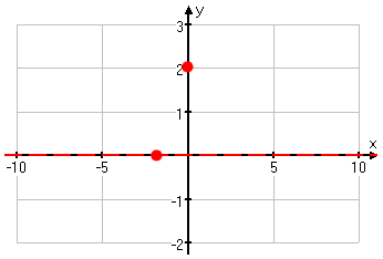
So the intercepts are at (0, 2) and (−2, 0). I'll draw these points on the graph:

Content Continues Below
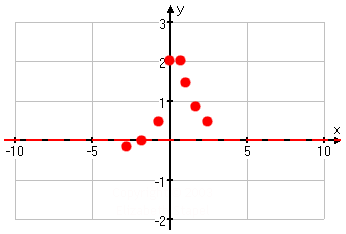
I'm not sure, just from the one asymptote and the two points I have so far, quite what is going on with this graph, so I'll plot a few more points.
I found some of these points just in order to let me know what was happening up near the top of the curve, where the graph looks like its behavior might be a bit weird. If I'd skipped those x-values between 0 and 1, I might have thought that the graph turned at x = 0; by plotting a few extra points, I now know better.
The points near the top are a bit too close together for me to draw them on the graph, so I'll just keep them in mind while I plot the other points:

With these points (and the others from the T-chart in between x = 0 and x = 0.5), I can better see what is going on.
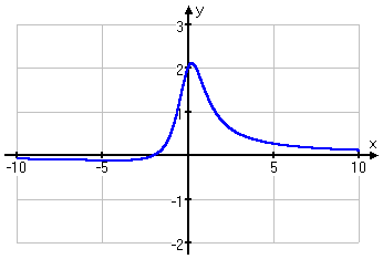
Connecting the dots, I get my graph:

Affiliate
I plotted a lot of points so I could see what was going on with this rational, especially near the top of the curve, where the extra points told me that the curve was rounded.
Most rationals do not need this many points, but don't be surprised if you do encounter one like this. Just keep plotting points until you're comfortable with your understanding of what the graph should look like. If you have a calculator with a table utility, then you can use that utility (as I did above) to help you find all the points you need.
URL: https://www.purplemath.com/modules/grphrtnl2.htm
You can use the Mathway widget below to practice graphing rational functions. (Or skip the widget, and continue on to the next page.) Try the entered exercise, or type in your own exercise. Then click the button and select "Graph" to compare your answer to Mathway's.
Please accept "preferences" cookies in order to enable this widget.
(Click "Tap to view steps" to be taken directly to the Mathway site for a paid upgrade.)
Select a Course Below
Standardized Test Prep
Homeschool Math
© 2024 Purplemath, Inc. All right reserved. Web Design by ![]()


