Introduction to Graphing Exponential Functions
Purplemath
Graphing exponential functions is similar to the graphing you have done before. However, by the nature of exponential functions, their points tend either to be very close to one fixed value or else to be too large to be conveniently graphed.
In fact, there will generally be only a few points that are reasonable to use for drawing your picture. So make sure that you're comfortable with the shape of exponential functions, as this will help you graph when actual points aren't necessarily very useful.
Content Continues Below
Picking sensible points will require that you have a good grasp of the general behavior of an exponential, so you can fill in the gaps.
What is a basic property of exponentials?
Affiliate
Advertisement
Remember that the basic property of exponentials is that they change by a given proportion over a set interval. For instance, a medical isotope that decays to half the previous amount every twenty minutes and a bacteria culture that doubles every day each exhibits exponential behavior, because, in a given set amount of time (twenty minutes and one day, respectively), the quantity has changed by a constant proportion (one-half as much and two times as much, respectively).
(Note: Many ["most"?] exponentials will have a messy doubling/halving time, so it is often more useful to work in terms of tripling, quadrupling, etc, times, or a given exercise may ignore the issue entirely. If the base of the exponential is not 2 [or ½], then don't expect the doubling/halving time to be emphasized — or else don't expect that doubling/halving time to be a nice neat whole number.)
This trait — that there is a fixed halving or doubling time — is basic to exponential functions. But it can make graphing a bit dicey.
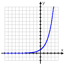
You can see this behavior in any basic exponential function, so we'll use y = 2x as representative of the entire class of functions:

On the left-hand side of the x-axis, the graph appears to be on the x-axis. But the x-axis represents y = 0. Can you ever turn 2 into 0 by raising it to a power? Of course not. And a positive 2 cannot turn into a negative number by raising it to a power.
So the line, despite its appearance, never goes below the x-axis into negative y-values; the graph of y = 2x is always actually above the x-axis, even if only by a vanishingly-small amount.
So why does it look like it is right on the axis? Remember what negative exponents do: they tell you to flip the base to the other side of the fraction line. So if, say, x = −4, the exponential function above would give us 2−4, which is 24 = 16 and then flipped underneath to be , which is fairly small.
By nature of exponentials, every time we go back (that is, whenever we move further to the left) by 1 on the x-axis, the line is only half as high above the x-axis as it had been for the previous x-value. That is, while for x = −4, the line will be only half as high, at , for x = −5.
Content Continues Below
So, while the line never actually touches or crosses the x-axis, it sure gets darned close! This is why, practically speaking, the left-hand side of a basic exponential tends to be drawn right along the axis. If you zoom in close enough on the graph, you will eventually be able to see that the graph is really above the x-axis, but it's close enough to make no difference, at least as far as graphing is concerned.
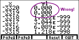
If you are using TABLE or some similar feature of your graphing calculator to find plot points for your graph, you should be aware that your calculator will return a y-value of 0 for strongly-negative x-values. Your calculator can carry only so many decimal places, and eventually it just gives up and says, "Hey, zero is close enough":

But you should not forget that this is just a mark of the limitations of the technology. Like I frequently tell my students: "Student smart; calculator stupid". You need to remember that, no matter what the calculator says, the graph is still above the x-axis; the y-values are still positive, though very, very, very small.
Let's look again at the graph of y = 2x:

You can see that, on the right-hand side of the x-axis, the graph shoots up through the roof. This is again because of the doubling behavior of the exponential. Once the functions starts visibly growing, it keeps on doubling, so it gets very large very fast.
Affiliate
You will not generally be plotting many points on the left-hand side of the graph, because the y-values get so close to zero as to make the plot-points indistinguishable from the x-axis. You'll be drawing that side of the graph as riding along on top of the axis.
And you will not generally be plotting many point on the right-hand side of the graph, because the y-values get way too big. This is why I've gone on at length about the general shape and behavior of an exponential: You will need this knowledge to help you with the graphing, so make sure you have a fairly good grasp of it.
What you should know when graphing exponentials:
- The function's variable will be in the power.
- The number with the power on it is called the base.
- Exponential functions have doubling (or halving) times.
- Graphs will usually look fairly horizontal for one half.
- Graphs will usually grow crazy fast for the other half.
- Take what your calculator tells you with a grain of salt.
- Graph carefully and neatly.
URL: https://www.purplemath.com/modules/graphexp.htm
Select a Course Below
Standardized Test Prep
Homeschool Math
© 2024 Purplemath, Inc. All right reserved. Web Design by ![]()


