Scatterplots: Correlation, Outliers, and Model Types
Purplemath
You may be asked about the "correlation", if any, displayed within a particular scatterplot. The word orrelation can be used in at least two different ways: to refer to how well an equation matches the scatterplot, or to refer to the way in which the dots line up. If you're asked about "positive" or "negative" correlation, they're using the second definition, and they're asking if the dots line up with a positive or a negative slope, respectively. If you can't plausibly put an increasing or decreasing line through the dots (that is, if the dots are just an amorphous cloud of specks, or if they line up vertically or horizontally), then there is probably no correlation.
Content Continues Below
A note on terminology: If a scatterplot is said to show a "high" or "strong" positive correlation, this does not mean that a straight line drawn amongst the dots (being a guess as to where the dots "ought" to be, were life not so messy) would have a high-number positive slope; instead, it means that the dots are closely clustered on or near the line drawn through the dots, so that the match of the dots to the line looks to be fairly strong. A "perfect" positive correlation means that the dots all lie on the line. The terminology works the same way for negative correlations.
-
For each of the given scatterplots, determine whether the plotted points appear to have positive, negative, or no correlation.
Plot A
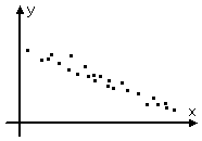
Plot A shows a bunch of dots, where low x-values correspond to high y-values, and high x-values correspond to low y-values. It's fairly obvious to me that I could draw a straight line, starting from around the left-most dot and angling downwards as I move to the right, amongst the plotted data points, and the line would look like a good match to the points. Such a line would have a negative slope, and the plotted data points would all lie on or very close to that drawn line.
So there does appear to be a strong correlation here and, because a good-fit line drawn amongst these points would have a negative slope, that correlation is negative.
Plot A: negative correlation
Plot B
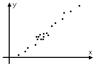
Plot B shows a bunch of dots, where low x-values correspond to low y-values, and high x-values correspond to high y-values. It's fairly obvious to me that I could draw a straight line, starting near the left-most dot and angline upwards as I move to the right, amongst the plotted data points, and the line would look like a good match to the points. Such a line would have a positive slope, and the plotted data points would all lie on or very close to that drawn lline.
So there does appear to be a strong correlation here and, because the good-fit line drawn amongst these points would have a positive slope, that correlation is positive.
Plot B: positive correlation
Plot C
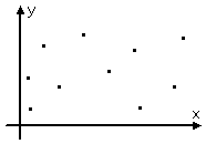
In Plot C, there doesn't appear to be any trend to these data points; they're just all over the place. I can't conceive of any straight line I could possibly justify drawing across this plot. Maybe additional data points could clear things up but, as things stand, I see no trends at all. With what they've given me, there is no apparent correlation between inputs and outputs.
Plot C: no correlation
Plot D

In Plot D, the data points line up very nicely! I can easily draw a horizontal line amongst these dots, and the line would clearly be a good fit to the data. However, the fact that the line would be horizontal means that the input values (that is, the x-values) are irrelevant to the output values (that is, the y-values). I can pick any input value I like, and the output is always going to be right around the same value.
So there is a definite trend to the data, and there is an excellent good-fit line for it, but that line only says that the input values are irrelevant. If the inputs are irrelevant, then there can't possibly be a correlation between inputs and outputs. That is, the inputs can't possibly have any relationship with the outputs, because the inputs are utterly immaterial to the outputs.
Plot D: no correlation
Content Continues Below
Outliers
You may also be asked about "outliers", which are the dots that don't seem to fit with the rest of the dots. (There are more technical definitions of "outliers", but they will have to wait until you take statistics classes.) Maybe you dropped the crucible in chem lab, or maybe you should never have left your idiot lab partner alone with the Bunsen burner in the middle of the experiment. Whatever the cause, having outliers means you have points that don't line up with everything else.
-
Identity any points in the following scatterplot that appear to be outliers.
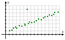
Most of the points seem to line up in a fairly straight line, but the dot at (6, 7) is way off to the side of the general trend-line of the points; in particular, it is quite a bit higher than the trend indicated by the rest of the plotted data points.
It is a bit of a judgement call, deciding whether a given data point represents reasonable real-life variability, or if it's actually an outlier. Fortunately, they only give me really obvious cases like this in my algebra class, so the answer is pretty darned clear.
outlier: (6, 7)
Outliers are the points that don't appear to fit, assuming that all the other points are valid. In order to get a good-fit line for whatever it is that you're measuring, you don't want to include the "bad" points; by ignoring the outliers, you can generally get a line that is a better fit to all the other data points in the scatterplot. This is why determination of, and elimination of, outliers can be very important.
Model Types
Advertisement
Usually you'll be working with scatterplots where the dots line up in some sort of vaguely straight line. But you shouldn't expect everything to line up nice and neat, especially in "real life" (like, for instance, in a physics lab). And sometimes you'll need to pick a different sort of equation as a model, because the dots do appear to line up in a specific way, but that way happens not to be in a straight line.
Affiliate
The line that appears to be a good fit to the data points is often called a "model" or a "modelling equation", because you'll be using that line's equation as the description or rule for whatever it is that the data points relate (such as time after release versus the height of the object which has been released). Given a set of data points, you may be asked to decide which sort of model (that is, which type of equation) would provide the best fit to the scatterplot of data. To some extent, this will involve using your own judgement; fortunately, though, they usually give you only a few choices, and make the answers pretty obvious. (This will not be the case in real life!)
-
Determine which sort of equation you think would best model the data in the following scatterplots, and explain why. (Choices are quadratic, exponential, and linear.)
Graph A
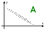
The data points in this scatterplot look a lot like the points in all of the previous scatterplots that shows positive correlation; that is, these dots appear to indicate that a straight line with positive slope would fit nicely amongst the dots. So my feeling is that the best model would be:
linear model
Graph B
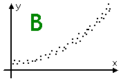
The data points in this scatterplot do not appear, to me, to line up in a straight line. Instead, they appear to show a gentle increase in curvature, so the line though the dots would be curving upwards slowly. Quadratic equations generally end up increasing fairly quickly, but they start out (near their vertices) with gentle curvature like this. Exponentials stay fairly flat, until they shoot up; these dots don't give that indication. So, of the given choices, I think the best model would be:
quadratic model
Graph B
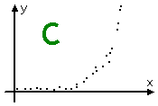
The data points in this scatterplot hug the x-axis until about halfway across, and then shoot upward. This is clearly not linear, and is probably not quadratic. However, this is very much how exponential functions graph. So I think the best model for this scatterplot would be:
exponential model
In general, expect only to need to recognize linear (that is, straight-line) versus quadratic (that is, somewhat curvy-line) models. You will likely never need to recognize anything that you haven't already covered in class. For instance, if you haven't yet studied logarithms, then you won't be expected to recognize the need for a logarithmic model for a given scatterplot.
The next page explains how to define these models, called "regressions".
URL: https://www.purplemath.com/modules/scattreg2.htm
Select a Course Below
Standardized Test Prep
Homeschool Math
© 2024 Purplemath, Inc. All right reserved. Web Design by ![]()


