Scatterplots: Introduction
Purplemath
Real life is messy, so it is expected that measurements taken from real life will be messy as well. When you plot these measurements of real life, it is expected that the dots won't line up exactly in a nice neat line, but will instead form a scattering of dots which, at best, might suggest a nice neat line. These scattered dots, when plotted on the plane, are called a "scatterplot".
Another difference between real life and algebra's functions is that a function, by definition, has no repeated x-values. But, when taking measurements from real life, we may find ourselves repeatedly collecting data with the same x-values.
Content Continues Below
For instance, during repeated experiments in a physics lab, we may find ourselves taking height measurments, for repeated throws of the proverbial "projectile", at the same number of seconds. Don't be surprised, when working with scatterplots, if the data contain points that you wouldn't have expected from your past experience with plotting lines in your algebra classes.
-
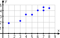
Create a scatterplot for the following data points:
(1, 1.9), (3, 2.2), (4, 3.3), (5, 3.3), (6, 4.1), (7, 4.1), (7, 4.6), (8, 4.5)
All I have to do here is set up my graphing area and plot the points to create my scatterplot. The x-values go from 1 to 8, and the y-values go from a little under 2 to a bit above 4, so my graphing area is pretty small, and fairly standard for graphing calculators.
I don't have to "do" anything with the plotted points, by the way. I don't have to connect them, or draw lines, or anything. My "answer" is only and exactly the following picture:
The previous exercise, with so few data points, is not representative of what would be encountered "in real life", but it gives the general idea of how scatterplots work. More typical of what you may see in, say, the lab would be the following exercise:
-
Create a scatterplot from the following data:
(1, 49), (3, 51), (4, 52), (6, 52), (6, 53), (7, 53), (8, 54), (11, 56), (12, 56), (14, 57), (14, 58), (17, 59), (18, 59), (20, 60), (20, 61)
Advertisement
One of the first things I notice is that I've got points with the same x-values but different y-values. This would never happen with a standard algebra graphing exercise. But scatterplots are derived from real life, so this sort of messiness is to be expected. I don't have to "fix" anything here; the repeated x-values are just part of the game.
Affiliate
They've given me a list of points, and want me to plot them. So my first task is to figure out what my axis scale values are going to be. (Unless they specify what I should use — and they haven't, in this case — my axes' scales will be up to me.) If I try doing an axis system with the "standard" −10 to 10 graphing-calculator-window types of values, none of the above points will even show up on my graph. So clearly I need to pick other scales.
As is common with these sorts of data sets, all the x- and y-values are positive, so I only really need scales for the first quadrant. The y-values are much larger than the x-values, but instead of squeezing all the y-values together, I'll spread them out (so I can see them better) by using an "interrupted" scale. My "answer" for this exercise is the following scatterplot:
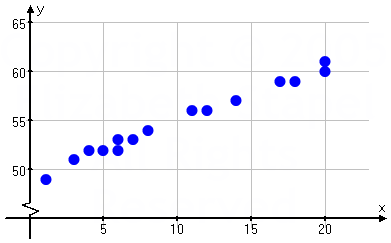
The little "hicky-bob" at the bottom of my y-axis above shows that I've skipped some of the scale values; it indicates a "scale break". The indicator of the omitted portion of the vertical axis is the part that's highlighted in red below:
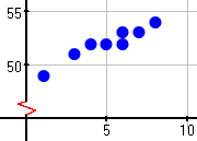
For some reason, this broken-axis notation, being the "interrupted" scale I'd mentioned, seems almost never to be taught in schools, though it is very commonly used in "the real world". For instance, if you read financial journals, you're very likely to see many graphs with this sort of axis notation.
Content Continues Below
You'll probably be expected to do your scatterplots in your graphing calculator. My calculator gives me this picture:

You will often need to adjust your WINDOW settings in order to have all your data points show up on the screen. I used window settings of 0 ≤ X ≤ 25 with an X-scale of 5 and 45 ≤ Y ≤ 65 with a Y-scale of 5 for the above graph.
When you're done with the scatterplot, don't forget to turn the STATPLOT "off", or the parameters for the statistics graphing could mess with your regular graphing utility.
I will give you fair warning now: It has become fashionable to insert the topic of scatterplots and regressions into algebra and other non-statistics classes, and to require students to use a graphing calculator to answer questions. While they may give you the slope formula and the Quadratic Formula and all sorts of other stuff on the test (even though you should have memorized them), they will NOT give you help with your calculator.
So take the time NOW to pull out your owners manual, or go to the manufacturer's web site, or search online, or get together with a friend to figure things out, because if you're doing this stuff in class, you ARE going to have to know it, and know it "by heart", on the test.
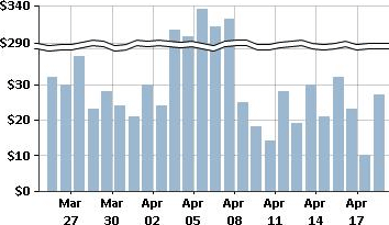
You may be required at some point to do plotting and charting in a spreadsheet, such as Excel, or other software. Many software packages include the option for broken scales, though the images may look somewhat different, such as the following Technet graphic:
URL: https://www.purplemath.com/modules/scattreg.htm
Select a Course Below
Standardized Test Prep
Homeschool Math
© 2024 Purplemath, Inc. All right reserved. Web Design by ![]()


