Graphing Straight Lines: An Overview
Purplemath
In this overview, we will start with graphing straight lines, and then progress to other graphs. The only major difference, really, is in how many points you need to plot in order to draw a good graph. But those increased numbers of points will vary with the issues related to the various types of graphs.
Content Continues Below
Before we get started, though, let me say this: You should do neat graphs, which means that you should be using a ruler. If you don't have a ruler, go get one. Now. A cheap plastic six-incher will help immensely, and you can get major brownie points from your instructor by using one.
And, no, using graph paper does not excuse you from using a ruler.
Straight-Line Graphing
Suppose we have been given the equation y = 3x + 2 to graph. Since the variables in this equation are simple in form — just a plain x, as opposed to, say, an x2 or an | x | — this equation graphs as just a plain straight line. To begin the graphing of this equation, we need to draw what is called a "T-chart".
What is a T-chart?
A T-chart is a table for keeping track of the (x, y) points that you'll be finding for your equation; a T-chart looks like this:

Affiliate
Then we will pick values for x, plug them into the equation, and solve that equation for the corresponding values of y.
We must be careful to remember to pick at least one or two negative values for x; using only positive numbers can be misleading later on, so it's best to avoid creating that bad habit now. Also, we should try to plot at least three points. It's just safer that way: if we mess up on one point, we'll know, because it's dot won't line up with the others.
This is what the T-chart looks like with some values plugged in:

Some people like to add a third column in which they write down what the actual plot-points are, which looks like this:

(If you're using a graphing calculator, you can probably have the calculator fill in the T-chart for you. Check your manual for a "TABLE" utility, or just read the chapter on graphing. Once you know how to use this utility, then you can just copy your T-chart from the calculator screen.)
Content Continues Below
How should you draw a proper axis system?
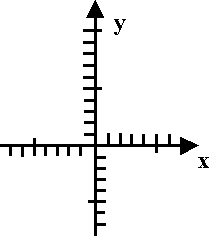
Now that we have our plot points, we draw a NICE NEAT set of axes, using our ruler. This means drawing an EVEN, CONSISTENT scale on the axes (that is, drawing evenly-spaced tick-marks for the numbers on the axes), and maybe even labelling the axes with their variables. We draw arrows on the ends of the axes where the numbers are getting bigger (that's what the arrows stand for, ya know!), and draw arrows NOWHERE ELSE.
For comparison:
This is a good axis system:

This is a bad axis system:

(By the way, did you notice how my tickmarks for 5 and 10 on my axes above are longer than the others? That's not something we "have" to do, but I've learned from experience that it can be very helpful when I'm counting off to plot my points. Something to consider.)
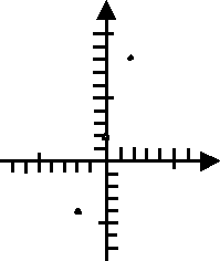
Now we plot our points:

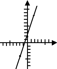
The points line up properly, so we know that we've done the computations and plotting correctly. Now we can put our ruler against our dots, and draw our line:

The graph is a nice straight line, going uphill (which was to be expected, because the equation has a positive slope value of m = 3) and crossing the y-axis at the y-intercept value of b = 2.
And remember: There are no arrows at the ends of graphed lines. Yes, I know many American middle- and high-school textbooks draw things this way. The rest of the world (and the rest of mathematics) draw their lines like the above. Regardless of your current age, you can draw "grown-up" graphs now.
Sometimes they'll give us an equation like 2y − 4x = 3. The first thing I always want to do is solve the equation for "y=". (Among other reasons, the "y=" form is the only way that my graphing calculator can accept the equation.) The solving process works like this:
2y − 4x = 3
2y = 4x + 3
y = 2x + 1.5
Then we can graph as usual.
By the way, it's often a good idea to use x-values which are spread out a bit. If the plotted points are too close together, we can end up not being quite sure of the angle of the line we're graphing. For the line above, I would probably pick points such as x = −4, x = −2, x = 0, and x = 2.
Affiliate
Advertisement
Sometimes we want to be a bit more particular about the values we pick for x. For instance, suppose we have to graph y = (2/3)x + 4. We can make our lives a lot easier by choosing x-values that are multiples of 3. By doing so, we will be able to cancel out the 3 in the denominator, and thus avoid fractions in our plot points. I mean, choosing x = 5 isn't wrong, per se, but choosing x = 3 would give us a much nicer y-value for our plotted point for this equation. If the fraction had had a denominator of, say, 7, then picking x-values that are multiples of 7 would be helpful. And so forth.
(If you would like to study graphing straight-line equations in greater detail, please see "Graphing Linear Equations".)
URL: https://www.purplemath.com/modules/graphing.htm
Select a Course Below
Standardized Test Prep
Homeschool Math
© 2024 Purplemath, Inc. All right reserved. Web Design by ![]()


