Graphing Linear Equations: More Examples
Purplemath
In all the previous exercises we've done, the equations we were given had been solved for one of the variables, usually the y.
Sometimes, though, we are given equations that have not yet been solved.
Content Continues Below
In such a case, it is usually easiest to do some algebra first, to solve the equation (usually for "y =") to make our lives simpler. (You may have seen this referred to as "solving literal equations".)
It is not required that we do the algebra first, but we can solve the equation first and then just plug-n-chug, or we can plug into the equation as given and then do the solving for each and every plug-in value. The former method (that is, solving once and then plugging in) is usually a big time-saver over the latter method (being plugging in and then solving every single time).
- Graph 4x − 3y = 12
Advertisement
Affiliate
For this sort of equation, I find that it's simplest to first solve for "y =". This is especially true if I'm using a graphing calculator to fill in my T-chart, because graphing calculators can only handle line equations when they're in the form "y =". So, to make my life easier, I'll solve this equation algebraically first.
To do so, I'll subtract the 12 over to the left-hand side, and I'll add the −3y over to the right-hand side. Then I'll divide through by 3, and simplify. Finally, I'll rearrange the equation (swapping sides) to get the y on the left-hand side, where I'm used to it being. Here are those steps:
So I'm actually going to be graphing this equation:
Since I'm going to be multiplying my x-values by a fraction whose denominator is 3, it will be simplest to pick x-values that are multiples of 3, so that the denominator will cancel out.
Here's my T-chart:
And here's my graph:
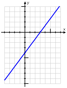
They asked for a graph; I've given them a graph, so I'm done.
Affiliate
-
Graph −3x = 6y − 2
First, I'll solve the equation for "y ="
Affiliate
So, after swapping the sides to put things in the usual format, my equation is:
Okay, so computing the plot points for this one is going to be messy, what with all the fractions. For my T-chart values, I'm gonna cheat and use my graphing calculator's table utility:
From these points, I draw my graph:
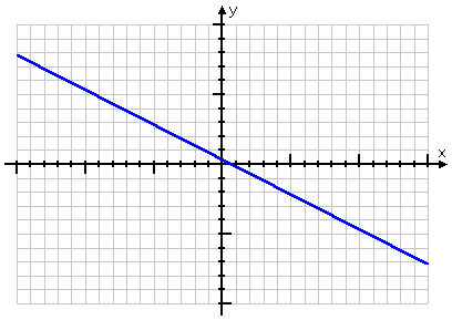
Note that this graph needed to be larger (in terms of the minimum and maximum axis values) than what I've drawn for previous linear equations. That's because the points were "messy", so I needed more of those points — and I needed those points to be further apart — in order to make sure my line was right. This is an example of a graph for which it is worth it to take the extra time and be careful.
Content Continues Below
Rarely, you'll see a graphing exercise that involves decimals. Converting to fractions might be helpful, in that you'll be able to see what sorts of x-values might be more helpful.
-
Graph y = 0.4x − 4
The decimal 0.4 is the same as the fraction . So I can regard this equation as being:
This tells me that picking x-values which are multiples of 5 will be more likely to give me nice, neat plot points. Here's my T-chart:
Even if I skip a few of the points at the ends (which I think I will), this is gonna be a wide graph, at least in terms of the scale.
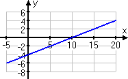
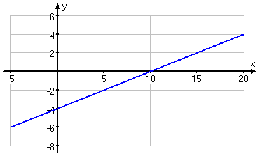
Take another look at that graph above; in particular, look at the scales on the two axes. The scales are not labelled in exactly the same way, which is why I needed to put numbers on the scales. Otherwise, the scales could be assumed to be −1, 0, 1, 2, 3 and so forth.
Instead, I drew the graphing area to fit my taste for how the graph should look. (That is, I adjusted things to what looked better in my personal opinion.) As a result, I needed to label the axes' scales, so as to avoid confusion.
Don't feel like you have to restrict every graphing area to being from −10 to 10. If you think that your graph is going too tall or too wide, then adjust the scales accordingly. As long as you label clearly, you can draw the graphing area with whatever scales suit you.
You can use the Mathway widget below to practice finding the graph of a straight line from a table of values. Then click the button and choose "Graph Using a Table of Values" from the pop-up box to compare your answer to Mathway's. (If you've picked your x-values to be multiples of 4, your table's values will almost certainly be "nicer" to plot than will be Mathway's. But your actual graphed line should be the same as theirs.)
Please accept "preferences" cookies in order to enable this widget.
(Click "Tap to view steps" to be taken directly to the Mathway site for a paid upgrade.)
What are the four ways of graphing linear equations?
Together with the method shown in this lesson, there are four methods for graphing straight lines.
- graphing with a T-chart (which always works, and can be helpful in deciding how to draw your graphing area)
- graphing from the intercepts (which gives you only two points, so it can be a little iffy)
- graphing from the y-intercept and the slope (if you get the intercept right, then the slope will give you as many points as you like)
- graphing via translations (which involves somehow figuring out the right "reference" graph, and then somehow figuring out how to move that graph in the "right" way)
About the only time I would go with using the intercepts would be when the equation has not been solved for y =; in that case, you'd plug zero in for each of the variables in turn, and find the corresponding value of the other variable.
I would *never* use translations, especially for something as simple as graphing linear equations. It's way too much work, and way too easy to mess up.
URL: https://www.purplemath.com/modules/graphlin4.htm
Select a Course Below
Standardized Test Prep
Homeschool Math
© 2024 Purplemath, Inc. All right reserved. Web Design by ![]()


